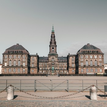
They say that you can tell a lot about a person by seeing their home. Well, seeing the new website of the UK Office of the European Parliament, I would guess it was designed by someone bored of the EP’s preferred colour of sun-bleached blue and who is a bit of an architecture fan. Why else would the UK Office put the Strasbourg Parliament building as the banner image? Strasbourg, the home of the EP’s monthly boondoggle!
Continuing my recent trend of being downright cheerful about new EP digital initiatives (it must be the week of sun in Brussels which has cleared off my normal cynicism), I like the new website.
My favourite part is without a doubt the EP News, which has all of the committees listed in an HTML table with each item on the agenda. No need to click to each committee and then open the agenda in a PDF or in a pop-up window. All the information, in one place. Fantastic.
The webmaster asks for feedback on the home page, so I’ve already sent in my comment. Add social bookmarking tools. Let people tag this on delicious, stumbleupon, their Facebook page, etc. Put it out there!
4 Comments
Find Out More
-
Denmark’s Election: Bacon and “Borgen”
April 8, 2026
-
Decoding the EU-India FTA: Chemicals & Sustainability
February 26, 2026
-
Decoding the EU-India FTA: Agri-food & Alcohol
February 25, 2026


March 19, 2009 | 5:42 PM
I see. Yes, completely agree. It is strange that the UK site is more user-friendly for general committee information than the central Europarl site.
March 19, 2009 | 5:38 PM
What I meant was the events part of what's going on in the committees. It's basically the same for all countries.
March 19, 2009 | 5:29 PM
The principle of subsidiarity. I imagine that the UK site is designed to speak directly to people in the UK. Right now it seems to be taking all EU news and not just UK specific news, but the events section is limited to only events in the UK. Michael
March 19, 2009 | 4:35 PM
Yes, the EP news part is nice. But will be much work to update. Why not have it centrally managed (translation for everything mus exist already).